Redesigning the cart and checkout of Skin(tet). A mobile-first cart and checkout for a skincare store, where gifts, samples and split installments read as one clear order
Product
skintet.comA cart that has to explain free delivery, up to three free samples, gifts tied to products and two payments with different terms — on a phone, in a few seconds. My task was to make the mobile cart clean, clear and intuitive, and then carry that experience over to desktop.
The product
Skin(tet) is a Ukrainian skincare store built around confident choice. About 70% of its traffic is mobile, so the phone layout is primary and desktop is derived from it.
The cart carries more than goods
Free delivery from 3,000 ₴, a sample picker that unlocks one, two or three samples at 5,000 / 8,000 / 10,000 ₴, gifts tied to a product or to the whole order, and installments whose limit depends on the product type — devices up to 6 payments, cosmetics up to 3.
What was broken
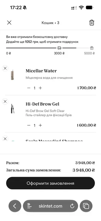
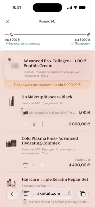
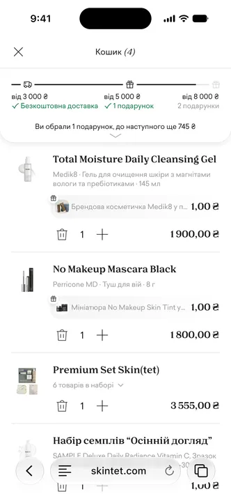
What the brief named as broken
- The summary didn’t show the whole order — no gifts, no delivery — and took up too much space.
- Splitting installments between cosmetics and a device had to read as clear and intuitive. It’s a constraint, not a feature.
- Picking samples had to be more obvious and consistent: easy to take or decline, never in the way of buying.
What I found on the live store
- The progress bar: three checkpoints for four thresholds; reached and unreached looked the same.
- Gifts sat below the fold, and picking one reset the scroll.
- Space was spent inefficiently: the payment summary, gifts and the rest took more room than they gave.
- The interface didn’t meet a11y standards — it needed an audit.
- Tap targets were too small even for desktop, let alone a phone; the icons had to grow.
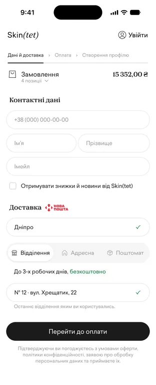
- Checkout could be simpler: merge some fields, split the form into logical parts.
Two questions I kept asking. Are we pushing for a bigger basket or for more orders? For the return visit or for this order? The thresholds reward a bigger basket; the brief’s metrics reward finishing the order. Most decisions below sit between those two.
Starting from the store’s research, not copying it
From Skin(tet)’s benchmark of Medik8 I kept what held up: a side drawer instead of a pop-up, the distance to free delivery in the cart, the phone number first, a remembered delivery choice, the promo code hidden behind a link.
What it could not give me: none of Skin(tet)’s own mechanics were there — no three-step sample thresholds, no product-linked gifts, no installments with different limits. Those had to be designed from scratch.
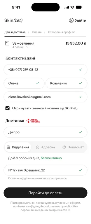
Baymard’s checkout research set the defaults where the brief was silent: one address field instead of street and house split, inline validation that switches on after the first attempt, and a summary where every line has a source: items, «Gifts, 2 × 1 ₴», promo, delivery, one total.
Cart & Checkout Usability Research
From wireframes to a prototype in code
First pass: 17 wireframes (A1–B8) — every state from the brief plus the ones it didn’t list: deleting a product that carries a gift, the total dropping below a threshold, limited stock, an item selling out mid-checkout, a payment going through for only half of the order.
After a few static drafts, I moved to code instead of polishing in Figma. A cart is motion, keyboard, scroll and thumb reach on a real phone.
Figma hides exactly the problems that break it — the list shaking while a panel animates, the iPhone keyboard covering fields, the layout jumping when a card is added.
Vue with design tokens from their Figma, a live link checked on the phone after every change.
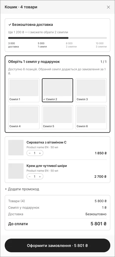
One scale for every threshold
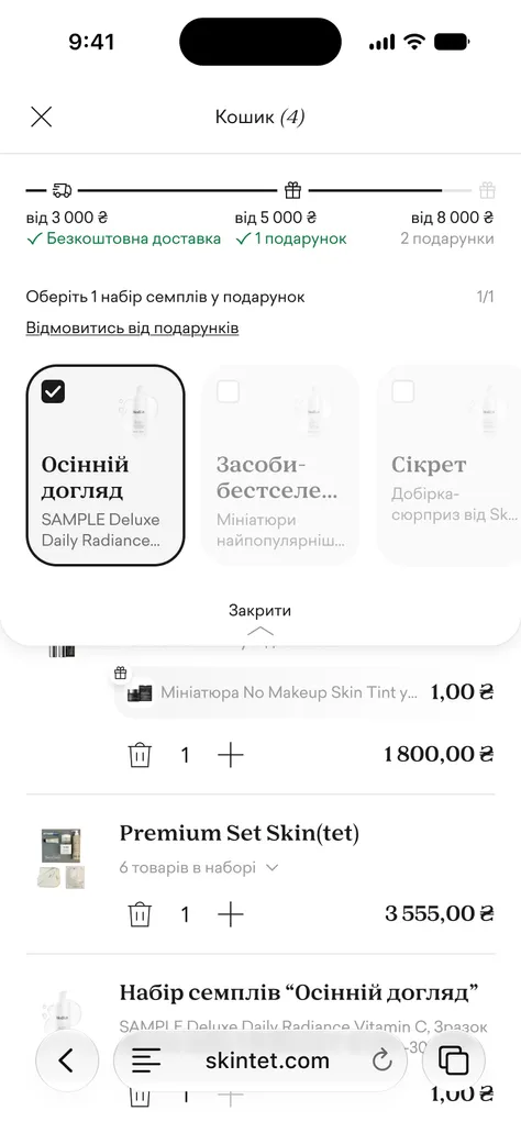
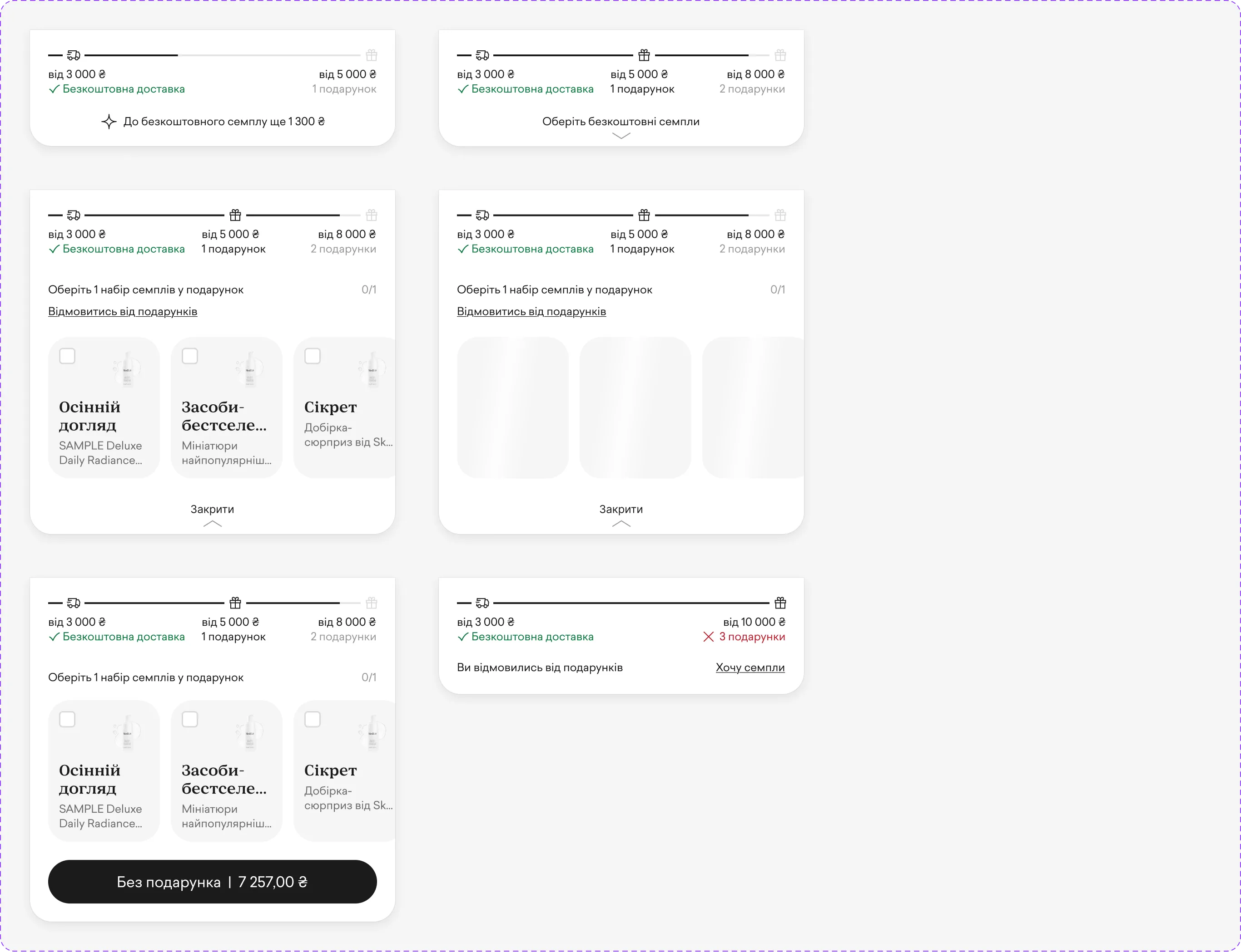
Delivery and sample milestones share one progress scale. It shows only the next two or three stops, not all four at once; stops slide along as the cart grows, so the next goal is always in view.
Under the scale, a hint points to the nearest goal: «1,100 ₴ more to free delivery», then «1,300 ₴ more to a free sample».
A milestone label has three states: out of reach (muted), available but not picked (dark), picked (green check). Delivery turns green on its own — there is nothing to pick.
The panel keeps the same height whether it shows a hint or the picker’s toggle, so nothing jumps when samples unlock.
Making the sample choice impossible to miss
The picker opens from the scale and lies over the item list without shifting it: «Pick 1 sample set as a gift», a counter «0/1», cards to scroll.
Once the limit is reached, the other cards fade; tapping one gives a small shake instead of an error message.
After a pick, the toggle reports progress: «You picked 1 gift, 745 ₴ to the next one», or «Pick 1 more free sample» when a slot is still open.
The first «Order» tap. If a slot is free, it opens the picker instead of checkout. The panel is sticky, so the choice and the button are on screen together, and the button reads «Without a gift | 7,257 ₴». The second tap goes on to checkout. The basket gets its nudge, and the order is never blocked.
Declining is allowed and quiet: «You declined the gifts» with a link back, and the available milestones get crossed out in red instead of nagging. Delivery stays green — it isn’t a sample.
Dropping below a threshold closes the picker and says what was lost and how to get it back.
Two payments that don’t look like a mistake
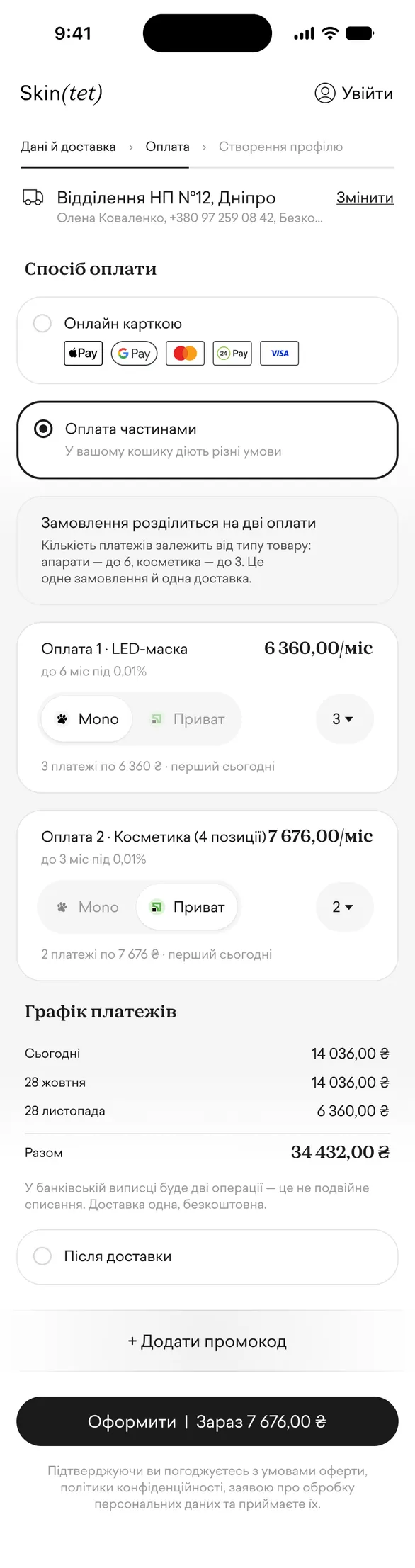
When a device and cosmetics share a cart, the installment option opens into two plans: «Payment 1 · LED mask, up to 6» and «Payment 2 · Cosmetics, up to 3». The reason is said in plain words: the store sets the limit by product type, so the order splits into two payments — one order, one delivery.
Samples, the order gift and delivery travel with the cosmetics.
One shared schedule shows what leaves the account each month across both plans. A run of equal payments collapses into a range: «January – March · 617 ₴ each». The button says what is charged now: «Place order | Now 7,676 ₴».
The schedule is calculated by the server; while it recalculates after a bank or term change, the numbers turn into skeleton bars of the same size — the screen never shows a wrong figure.
The hardest state: the bank declines the second payment. The heading becomes «One payment complete», the note says the order isn’t cancelled and delivery stays single, and the main button finishes the second payment.

Desktop derived from mobile
Both the cart drawer and checkout split into two columns. In the drawer, gifts, picks and promo sit on the left, items and checkout on the right; in checkout, the form is on the left, delivery and the order on the right, with the items always visible.
An accessibility audit of my own work
A WCAG 2.1 AA pass at 375 and 320 px: 17 issues found, 2 critical. Fixed: secondary text contrast, old prices read aloud as a second price. Left as a handoff list: unlabeled delivery fields first.
Result
Delivered
Mobile and desktop layouts, every state from the brief and the edge cases it didn’t list, a prototype on a real phone in two gift models — samples to pick, or a gift card above the items — and the accessibility report.
Code first, final Figma second. After the wireframes, the prototype became the source of truth; once it held up on a real phone, I had the Figma file rebuilt from it — screens laid out by flow, and every repeating piece turned into a component with its variants: the threshold scale, sample card, gift line, installment plan, payment option, order summary. Each component carries a short spec of its states, motion and accessibility attributes, plus a link back to the source file. The mockups describe what already works instead of promising what might, and the team gets a file it can maintain without me.
Conclusion
What I learned. With AI, prototyping in code is faster than drawing mockups, not slower — and it catches what a mockup hides: motion, scroll, the phone keyboard. That makes the loop short: build, test with people, change, test again. Rebuilding the Figma file from the prototype, also with AI, took the routine out of the rest.
What I’d fix next. The «Gifts» line in the summary counts product gifts but not the order gift, which still appears in the item list. The middle stop on the scale sits at a fixed offset because label widths aren’t measured. Both are logged in the component docs.