The CV on Djinni exists in three different forms that are not interconnected, which disrupts the most crucial aspect of the application flow
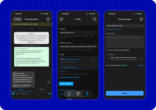 Before
“Every time I apply to a new job posting, I upload a new file because I don’t understand if it’s still relevant.”
“I don’t understand which specific file I submitted when I applied for the job.”
“It’s hard to find where to upload the file if you haven’t done it on the site before.”
Navigating the flow from the push notification about a new job posting to apply on the phone is quite challenging.
There is very little to tell whether a file is still relevant—especially on the application screen. There’s a lack of a user-friendly title or date of the last update, and a preview is needed to ensure that the file is correct.
The process needs to work from the beginning, where the user first encounters the CV as something they need before they can apply.
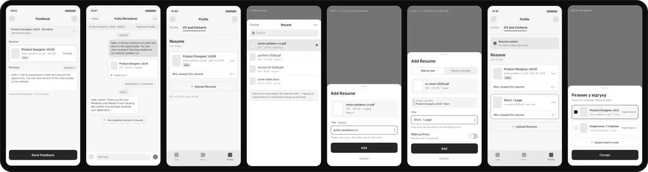

I started by standardizing the CV card and began working on the upload flow and file organization.
I had to compromise to isolate the problem and speed up delivery. As a result, the application now features a new main profile screen from which links lead to the current profile, contacts, and updated CV file management.
The settings have also found a more suitable place.

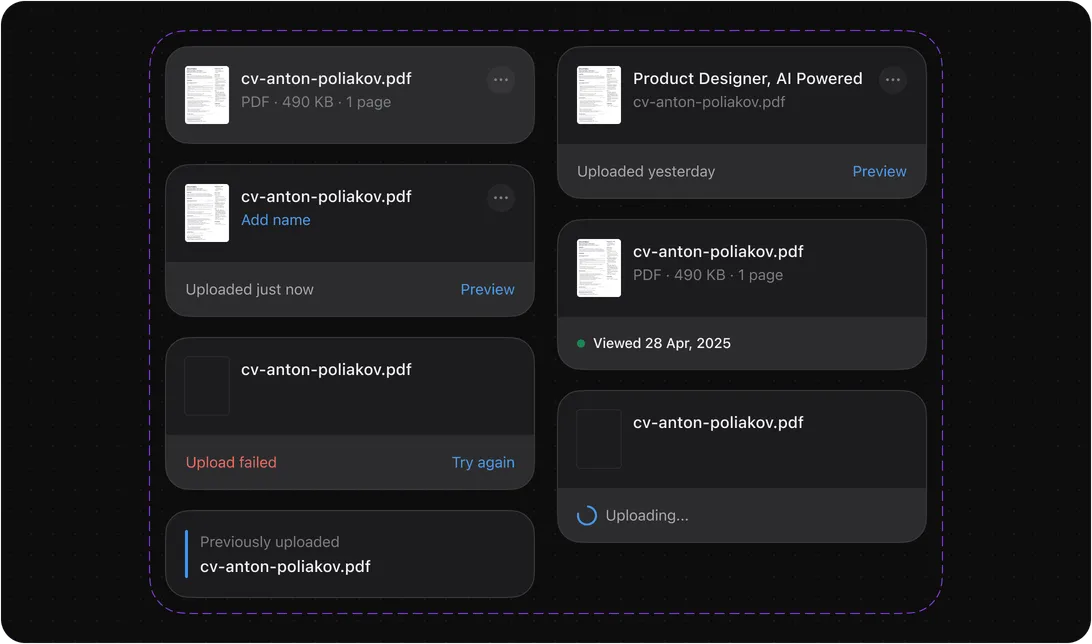
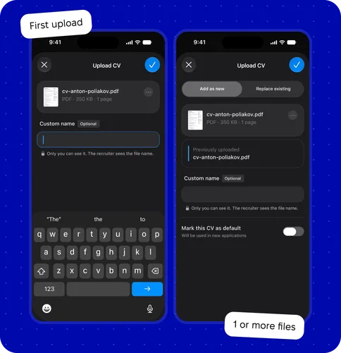
I decided to separate the initial file upload from all subsequent ones. This is done to prevent users from adding too many identical CVs. The app has a technical limit of 5 files.
The solution is to provide a clear option to replace an existing file and to see which was the last CV uploaded. Unlike the first upload, subsequent uploads allow the user to immediately mark a file as the default.
To test the interface in conditions as close to production as possible, I set up a project in React Native and created real prototypes for two flows: file uploads and job applications.
Such prototypes are much easier to validate with users. They make it possible to run hallway testing and find the weakest spots.
The first prototype covered the updated navigation structure, an intermediate profile screen that simplified the release and got it out faster, notification settings, the upload process, and CV file management.
The second prototype improves the job application submission process. The job listing screen remains unchanged.
Everything else was aimed at enhancing this process. There is no good application flow without proper file organization. The result is a clear, user-controlled submission: the message template can be edited, the salary set for this application, the CV checked for relevance — or a new one uploaded.
This scenario is not yet implemented, but it works, and it is a strong candidate for testing with real users. I would track the number of re-uploaded files on the application submission screen — it should drop significantly. I also anticipate an increase in the number of successfully submitted applications and a reduction in submission time. The number of applications submitted per day relative to the number of job postings could also be a good indicator of the improvement in the quality of this flow.
Thank you for reading this case study to the end. I hope you enjoyed it — if you are interested in collaborating, please get in touch. I would be glad to work together.